
20130630
pad0107
"pencil":
 Easily my least favorite, yet. It looks even worse from the back than the "mushroom".
20130629
pad0106
Why, it's a "paloma", of course:

Friends, if your knowledge is an incomplete as mine, you might have asked yourself, as I did, "What in the world is a 'paloma'?" To be honest, I thought that the tail (left side of the picture) was the head--which didn't help my understanding (but did feed my imagination [Tremors and Dune came to mind]). "Paloma" is supposedly a Spanish word for "dove". Knowing that, I reevaluated which side was the head.
Yeah, my folds were a little unprofessional, today. I folded the backbone fold too tightly, and it cramped everything.
Every morning, after I make the folds, I take it out to my mom and give it to her, since she gave me the book. Today, I asked, "Do you know what it is?" Smiling, she said, "No." Dad said, "It looks like a bird." One out of three. I told them my observations and found out that mom also thought that the tail was the head. Neither of them knew what "paloma" was.
I can still see the sandworm.
20130628
pad0105
If you use your imagination, this may look like a "mushroom":
 I've found all of these products, thus far, to require some imagination, but this one has been my least favorite because of how it looks from the opposite side:
 The folds look way too unfinished. Mushrooms generally do not look this different between sides. I'm hoping that it's simply because these are the elementary designs that the products aren't that satisfactory.
I looked forward through the calendar to question my theory. It seems the designs get more advanced at some points...and revert back to basic designs at others. Also, it seems that more than Sunday is kept from participating in the one-a-day scheme. Several days simply have short articles about origami-related information and others have multi-part/multi-day instructions. I intend to have a *completed* product every day; so I should finish this thing much quicker than the standard year.


I looked forward through the calendar to question my theory. It seems the designs get more advanced at some points...and revert back to basic designs at others. Also, it seems that more than Sunday is kept from participating in the one-a-day scheme. Several days simply have short articles about origami-related information and others have multi-part/multi-day instructions. I intend to have a *completed* product every day; so I should finish this thing much quicker than the standard year.
20130627

20130626
pad0103
Today, "bunny bookmark":
 I don't really like drawing on origami--it feels like it detracts from the art of paper folding. The ink also smeared (I was using a roller ball and the paper was glossy--and I ran my hand across it, of course). I fancied drawing a monster face instead of a rabbit face, but I decided rather to play along.
The non-square pages still bug me a little. It's really not my lack of skill in lining up edges and making clean folds. Honestly. I shan't be bothered to trim all 320-something pieces of paper; instead, I'll pretend that it adds a novice charm to the work. Yeah. People will believe that.
I just used the noun-form of "novice" as an adjective.
Calligraphy Roman
I haven't practiced Roman in some time.
 And it shows.
I also think I need to recalibrate my scanner. I've noticed that bright, vertical bar, left of the center, from the last couple scans. My scanner was also dropped during the move; so it may or may not be correctable.

I also think I need to recalibrate my scanner. I've noticed that bright, vertical bar, left of the center, from the last couple scans. My scanner was also dropped during the move; so it may or may not be correctable.
20130625
pad0101-02
Mom brought a book into my room, last night, entitled, Origami Calendar, by Margaret Van Sicklen. Another Margaret (the previous book that I went through, Learn Calligraphy, was by Margaret Shepherd). This amuses me. The book is very cute; the pages themselves are used up in the process of following the instructions on them. While not really reusable, I find it novel, and I have no guilt in turning the book into the art provided by the information on the very pages of it. It's the book's purpose. It's refreshing.
Anyway, each day (saving weekends--they're combined on one page) the page for the day before is folded for the current day into a, supposedly, incrementally more difficult model. Today's is entitled "nightingale".
 As you can see, the instructions weren't quite clear to me where to make the second fold. I thought I was folding for the wing and left a generous amount above the previous fold when, in fact, the amount above the fold was for the head (the head is pointing to the left). Took me three tries. Moving on.
On a technical note, the pages are not square: they are 145.5 mm by 144 mm--which is more than enough to keep the folds from being clean, as you can see. That's a pretty significant blunder, but not enough to destroy the utility of the book.
On another note, by "today", I mean June 25, 2013. The actual first page of the book, which I just completed, was January 1 and 2 (Saturday and Sunday), 2005. I'm going in the order of the book's pages, since that's the intention, disregarding the date shown; I intend to do one every day.
Anyway, each day (saving weekends--they're combined on one page) the page for the day before is folded for the current day into a, supposedly, incrementally more difficult model. Today's is entitled "nightingale".

On a technical note, the pages are not square: they are 145.5 mm by 144 mm--which is more than enough to keep the folds from being clean, as you can see. That's a pretty significant blunder, but not enough to destroy the utility of the book.
On another note, by "today", I mean June 25, 2013. The actual first page of the book, which I just completed, was January 1 and 2 (Saturday and Sunday), 2005. I'm going in the order of the book's pages, since that's the intention, disregarding the date shown; I intend to do one every day.
20130623
Calligraphy Celtic
I've been going through a Psalm a day, practicing the scripts that I know. I have been doing Bookhand and Italic up till now; then I realized that I should incorporate the others. Here's some more Celtic.

20130619
Calligraphy Italic
I realized, this morning, that I've been practicing Italic for several days, now, but never uploaded an update.
 I also realized that this will probably be the last time I post in Gainesville for some time (since I'm leaving in a couple hours). It has been an interesting two years of my life. I thank God for all the persons I was given relationship with during my stay here, especially those of Living Faith Fellowship. The Lord bless you all.
I've also reached the end of the Learn Calligraphy book. The only things lacking are some Italic joins and numerals. My recommendation goes with this book for those just starting out in Calligraphy and for those that only want to invest around fifteen bucks (book plus calligraphic markers). I'm quite satisfied with it. Should I want to pursue this further, I feel I have a good foundation to build on.
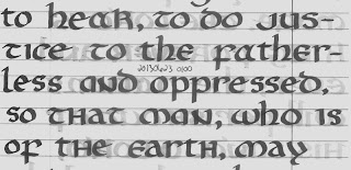
168 was the last page in the book, and Margaret labeled it 10101000. That was a very cute touch.

I've also reached the end of the Learn Calligraphy book. The only things lacking are some Italic joins and numerals. My recommendation goes with this book for those just starting out in Calligraphy and for those that only want to invest around fifteen bucks (book plus calligraphic markers). I'm quite satisfied with it. Should I want to pursue this further, I feel I have a good foundation to build on.
168 was the last page in the book, and Margaret labeled it 10101000. That was a very cute touch.
20130607
Calligraphy Bookhand

20130606
Calligraphy Bookhand

20130605
Calligraphy Gothic
Drawn capitals.

 The H, V, X, and Y were my design. I also modified several of the letters. The second T was listed as the alternate T, and I prefer it, but I don't dislike the standard T, unlike the letters that I redesigned. The A and W were also alternates. These letters all seem like a single family, now, while before they looked like they had some cousins in the mix.


Subscribe to:
Posts (Atom)